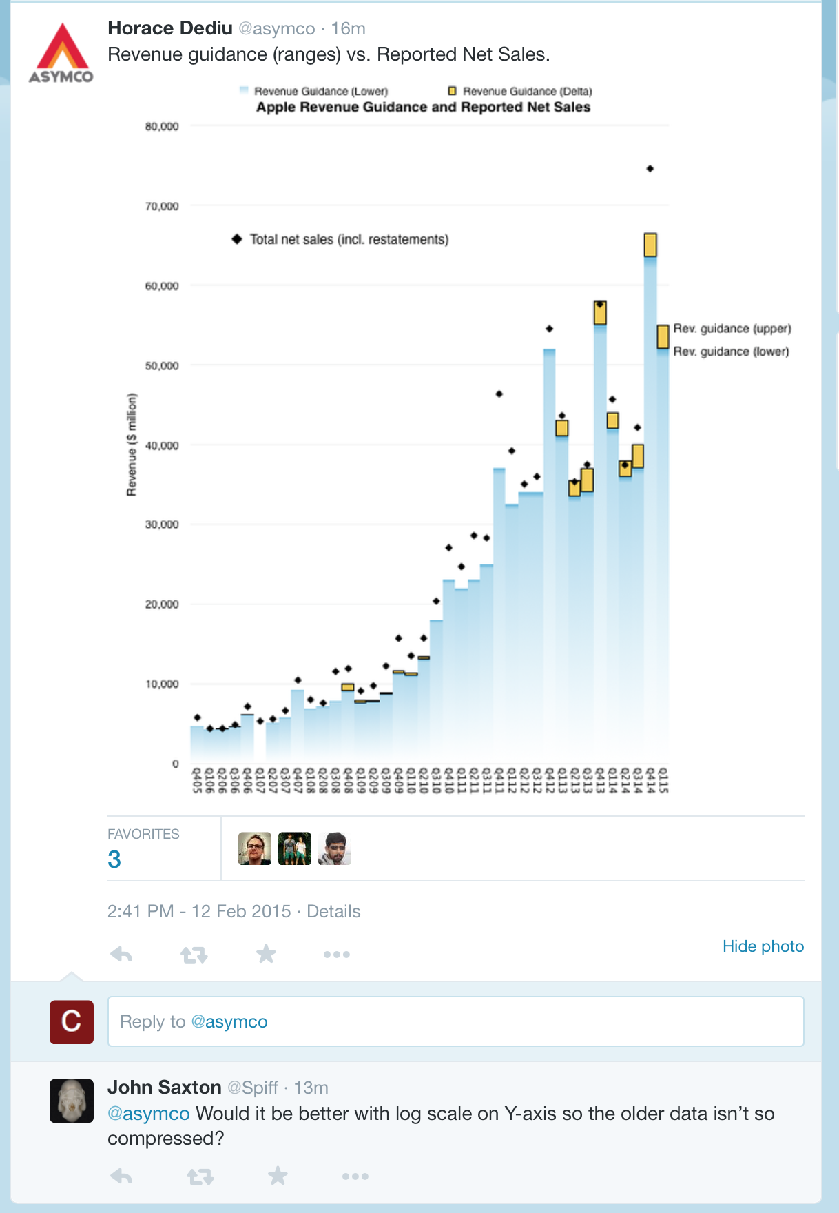
The graph @asymco tweeted is normal enough. Focus your attention on the reply from @Spiff.
The reason some of the revenue data looks compressed on the current revenue scale is because it is. Trying to change that is trying to mislead viewers.
What @Spiff proposes is an example of How To Lie With Statistics. He's intentionally trying to make the graph look different than it normally would to meet an agenda of his and give the viewer a different impression.
His tweet may seem innocuous but it's really bad. He's a bad scholar wannabe. Stuff like this is not OK. Bar graphs for typical quantities should use a linear scale, starting at 0, unless there's a damn good reason to do otherwise. If you do something else, the bars are no longer proportional to each other in the intuitive way, so it misleads viewers.
For example, suppose the graph started with revenue at $50,000,000 instead of 0. Then all the bars would be shorter. This would make the smaller bars shorter by a large percentage, and make them look even shorter compared to the big bars. That'd be really bad! When someone looked at it and thought "this bar is twice as big as this other bar", that would no longer be a valid way of reasoning due to not starting at 0.
Or suppose the graph used a log scale like @Spiff proposed. A log scale mean the revenue would be labelled like $0, $1, $10 $100, $1000, instead of like $0, $10 million, $20 million, $30 million, etc... See how misleading that could be? What it means is, again, when someone compares the sizes of the bars he gets the wrong idea. When he thinks, "This bar is about 20% higher than the bar before it", he's being played for a fool.
Don't play people for a fool. Don't try to trick them. Don't have an agenda for how you want your graph to look and then adjust things to achieve it. Just make a simple graph that makes sense and then leave it alone and let it speak for itself. Tinkering with your graph as @Spiff proposes is dishonest (or clueless and still harmful).
Scholarship, please.
Update: @asymco says:
Share prices are frequently graphed using log scales by default. I don't condone the practice.I'm sad to hear how common bad scholarship is. That's terrible. But I'm glad @asymco understands this and does a better job. Thumbs up to him! Here's @asymco's blog which I read regularly.
Update 2: @Spiff now agrees with my point about log scales (I think).
Update 3: Here is an example of a very bad article advocating bad use of log charts. It looks mainstream and has a tone of sharing uncontroversial knowledge.
Messages