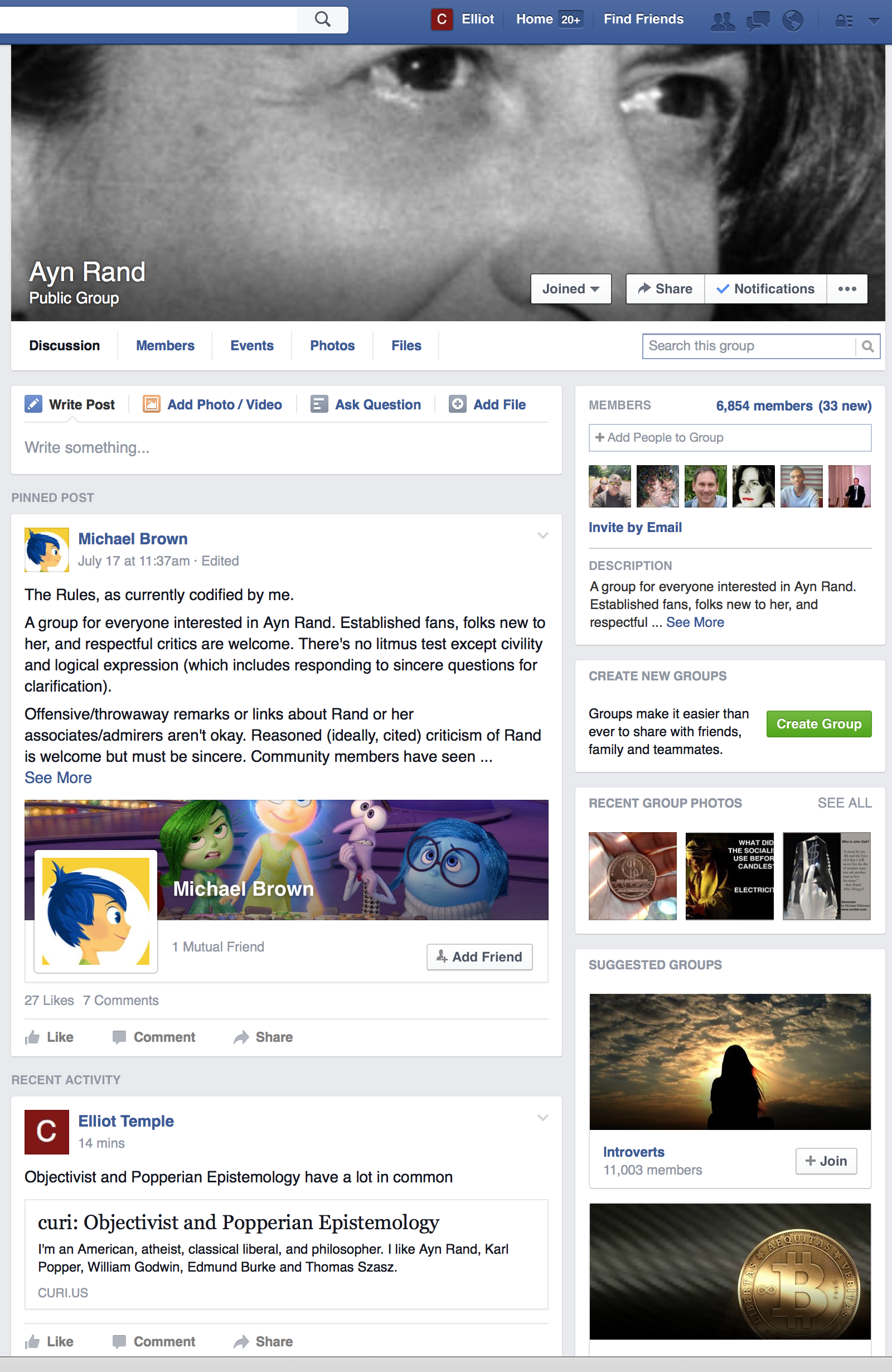
Look how much vertical space is wasted by the pinned post, every single time I visit the Ayn Rand group.
Keep in mind I'm using a larger screen and larger browser window than most people. You're seeing this zoomed in. Most people would see less. The content starts where it says "Recent Activity", so lots of people wouldn't see any content at all without scrolling down.
Some of the best space on the screen is being used for information people only need to read once, and maybe refer to again rarely.
I blame Facebook. The group owner, quite reasonably, wanted all members to read some information. He used one of the few features Facebook made available to him.
Part of the problem is he has a large signature. What should he do, get rid of it? It's Facebook's fault again. Why can't they hide the signature (and the "Add Friend" button) on the Pinned Post that people see all the time?
Look how much vertical space is wasted by the picture at the top. Again that's Facebook's choice. Facebook is the one who should make it easy to get a good looking group page. Facebook presented the guy with a place to put a picture. He put a picture. The results are bad. That is not his fault, he just followed along with what Facebook told him to do.
Look how the "Like, Comment, Share" buttons and the "27 Likes, 7 Comments" could fit together on one line, but are taking up extra vertical space by being separate. Look how the text "Pinned Post" and "Recent Activity" take up crucial vertical space. There's got to be a better way. Look how Michael Brown's profile picture appears twice on one post, wasting pixels. (And, by the way, I'm not even a web designer. I just dabble.)
Let's look lower down on the page now:

Count how many times my profile picture (the white C on a red background) is visible. Six! And all I did is post two links. What a waste of pixels!
Look how little content fits on the screen, even once we're scrolled down. My two posts have one sentence and a link. Then there's a post with two sentences. Then three comments, none with very much text (considering that Facebook hides long comment text behind a "See More" link.) And that's all you can see with a large browser window. That's so little!
Facebook has like a billion monthly active users. That's way more than enough to hire some good web designers. Facebook could spend a lot of money on good design for their major groups feature and it'd pay off.
I think Facebook does spend lots of money on this. Maybe they should spend more, but money isn't the primary problem. One big problem is Facebook doesn't know how to buy good design. There are lots of people offering to sell good design, and some of them are good designers, and some of them are bad designers. I figure Zuckerberg doesn't know what good design is, and his close friends and top executives don't know, and they doesn't know who to trust. They don't know which designers to believe. They don't know how to judge who really is an expert.
Another big problem is bureaucracy. I bet Facebook has some good designers, but then they get ordered to go do some specific stuff, rather than go around and take the initiative to fix whatever problems they can find. I bet Facebook has some capable employees who'd like to fix this, but their boss tells them to do something else.
And Facebook is a big company. Lots of different internal parts of Facebook have their own priorities and goals. So they all fight over screen space, each wanting their stuff, and that can make a mess. Good design requires saying "no" to a lot of requests, and that can be tough. You need to find designers who are actually good and then also empower them to stand up to the rest of the company and say "no" to most demands.
It's a hard problem to buy talent if you don't know how to think for yourself, so you aren't able to judge talent well. The only solution is philosophy. Zuckerberg and the rest of the top people at Facebook have to learn how to think well. Then they could detect a lot of phonies and fakers, and figure out which designers are good thinkers, even without learning design. With philosophy, they could tell which designers have the right sorts of methods of thinking, and make design arguments in ways and forms that could be correct. They'd be able to see if someone was the right kind of person doing the right kind of thinking about design, even if they couldn't judge all the details. And they could easily learn and go through a few basic examples. With good philosophy, this wouldn't be too much of a problem.
Messages (2)
Everything Changes !!
Even IOS got fucked up after my fav guy Scott Forstall Got fired.. I hate the Ibooks and hate the metro design ( Whatever u call it ).. Many things that I used to like changed.. Same with youtube and facebook .. They change things a lot and we try to adapt to their shit..
DDD
Facebook design and navigation is horrible. I really don't understand why so many people don't see it. It is not intuitive, it is not comfortable. It sucks.
Just look at Russian Facebook clone called VK (Vkontakte). Totally close on FB but it have nice, simple and easy design and navigation.
I guess people just get use to current layout and they don't realize that it is actually very uncomfortable. If you manage not only your page but like a group (i am working as OR manager and i have to update my company FB page all the time) you will struggle.
I guess nobody cares anyway =(